Fear? Not! Nation: UX for Social Good
Project Information
- Team: Kaitlin Simpson, Chris Ayala, Kit Cheng, Ben Green, Justin Millan
Roles : UX Researcher, Product Design & Development Lead- Duration: 4 months (March - June 2021)
- Project Site: fearnotnation.org
Project Overview
Fear? Not! Nation is a small, community-based charity supporting pediatric cancer patients and their families at Lurie Children’s Hospital in Chicago, Illinois. Our team applied a human-centered design process to help strengthen the charity's presence through sustainable, responsive design, as well as equip its founder with a larger, more accessible toolkit.This process included user testing, redesigning the organization's existing website, integrating existing social media channels, and providing the founder with a design system and social outreach tools.
Project Background
Fear? Not! Nation is a small, community-based charity supporting pediatric cancer patients and their families at Lurie Children’s Hospital in Chicago, Illinois. Their primary forms of support include raising awareness around the hardships of pediatric cancer while fostering a supportive community through social media and providing their signature care packages known as ‘Fist Bumps’ to pediatric cancer patients themselves.
Fear? Not! Nation’s founder came to us with an open mind and a wide set of opportunities. She explained to our team the importance of relaying the true stories of pediatric cancer patients and their families and wanted a way to best tell these stories while increasing fundraising and potentially expanding the charity’s operations.
Problem Statement
After assessing the charity’s existing website and social media channels, our team identified a number of opportunities we could tackle. The existing site had a number of flaws and limitations, such as the use of ambiguous language, incomplete and/or outdated pages and links, and overall non-responsivity. This led to our primary problem statement: how might we restructure and refine the website’s information architecture and strategize the content in order to streamline user flow nd promote easy access to all salient information about the organization?
Our Objectives
- Improve User Flow
- Rework Information Architecture
- Refine Content Structure
- Create a Mobile-First Design
- Integrate Social Media Content
- Establish Brand Guidelines
- Empower Creative Freedom
- Ensure Low Maintenance
Process & Methods
Our team employed a user-centered design methodology to address our problem statement. We broke our process into five main stages over the course of ten weeks: Discovery, Testing & Analysis, Design, Evaluation, and Implementation.
Discovery
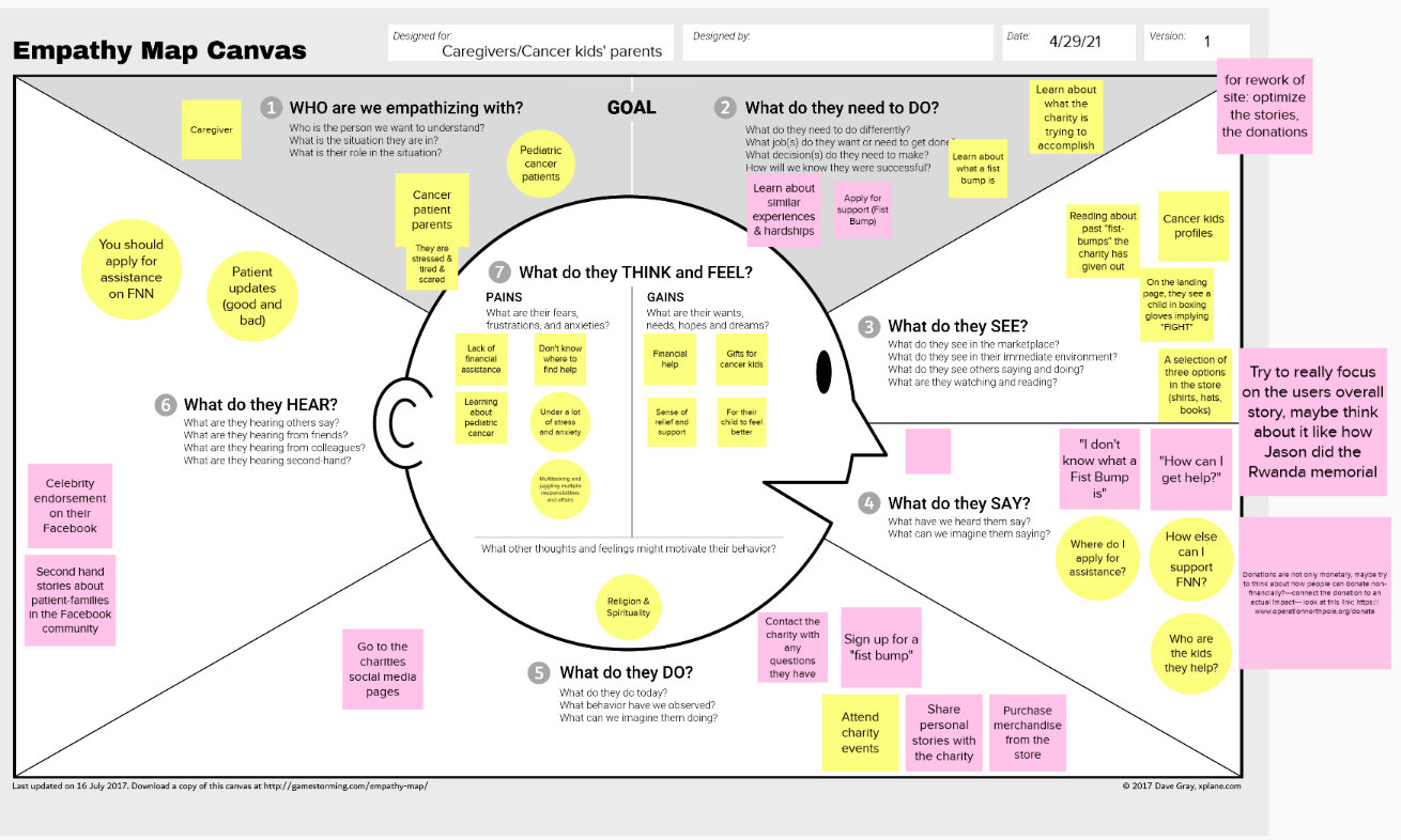
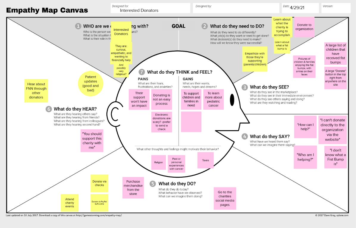
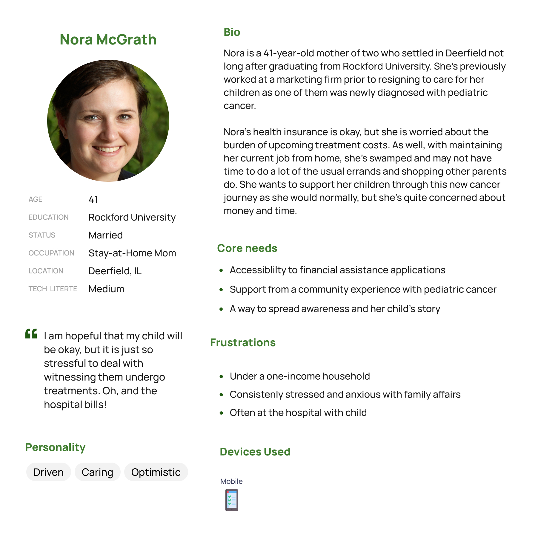
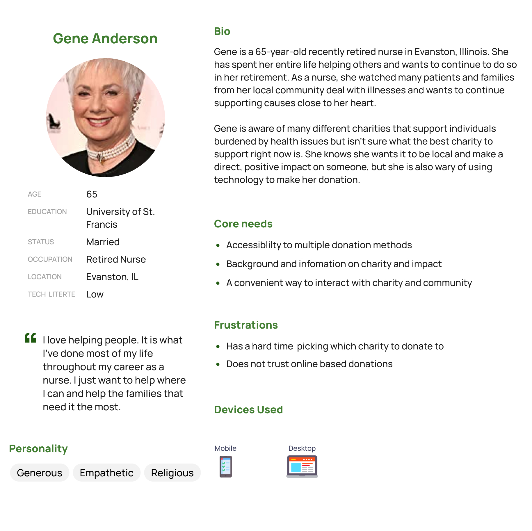
Our discovery phase consisted of conducting multiple sessions with our client in order to garner an understanding of the organization, its needs, and its primary users. In addition to these sessions, we compiled user data from FNN’s social media and their CMS analytics (Wix). The insights we gathered from our client meetings and user analytics contributed to our understanding of our target users. To ensure our understanding of the users and to synthesize our insights, we developed two personas to guide our research and design decisions:
As a second step, we performed a content inventory, allowing us to fully understand what was on the existing site, whether or not it was located properly, and what content was up-to-date.
Content Inventory Findings
- Multiple shop links were no longer active
- External fundraising & donation links were outdated
- Incomplete content on several pages, specifically pertaining to donation recipients' profiles
- Overlapping navigation
- No social media integration
Testing & Analysis
Using our content inventory, we translated the website’s content into disparate cards to perform a series of card sorts. We wanted to involve our stakeholders and users directly in the design process. With card sorting, we could understand how our users would categorize Fear? Not! Nation’s content in order to strategize the best possible information architecture for them. All card sorts were created and performed using OptimalWorkshop’s card sorting tool.
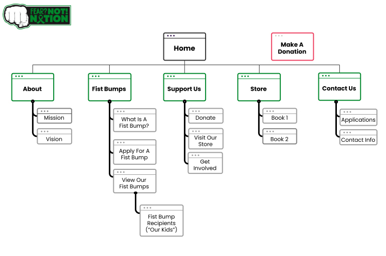
We ended up performing four card sorts in total: an internal open card sort, two external hybrid card sorts,, and a final external closed card sort to clarify and validate the proposed categories. Some proposed categories, such as ‘About Us’ and ‘Support Us’ received high agreement from users, while other categories that included charity-specific language (‘Fist Bumps’) caused confusion. In total, 36 unique participants completed the card sorting exercises, allowing us to arrive at five final categories for our main navigation:
- About
- Fist Bumps
- Support Us
- Store
- Contact Us
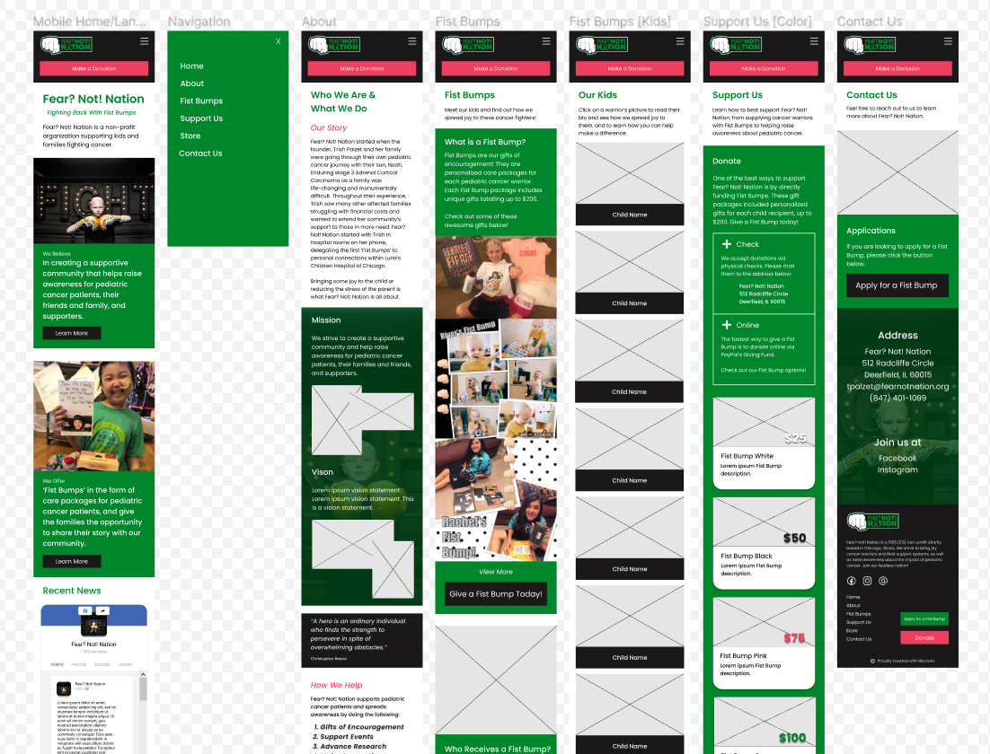
Our final step before moving onto the design phase was to test our proposed navigation by conducting a treejack test, also using OptimalWorkshop. We presented participants with five simulated tasks to test our infrastructure. Our participants were highly successful with 4/5 tasks, with the final task having a potential solution in our planned visual design. The treejack testing validated the findings from our card sorts and allowed us to create a site map to guide the rest of our project.
Design
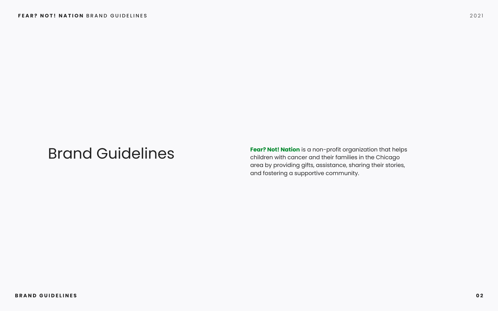
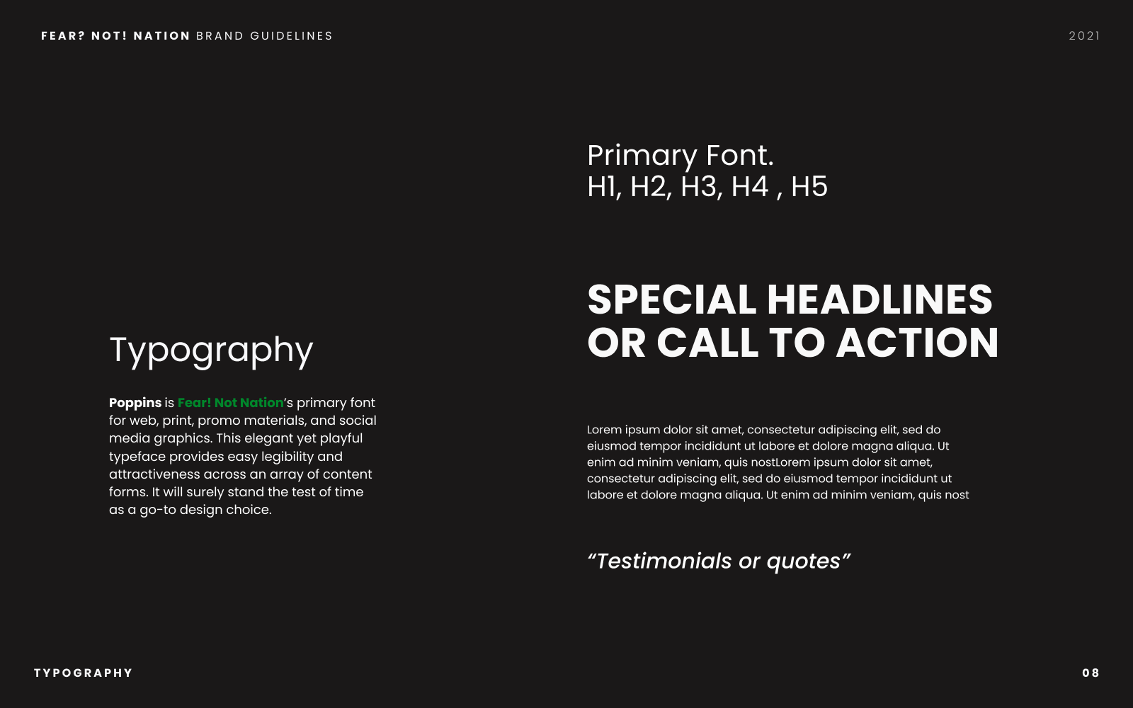
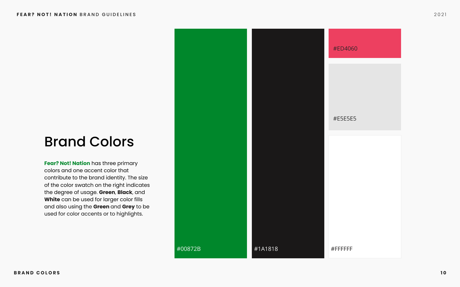
Our first step in designing a new product for Fear? Not! Nation was to create a design system and subsequent brand guidelines. The charity’s existing designs were quite varied across their website and print material. We knew that bringing consistency to their brand would help strengthen their message, increase memorability, and make it easier for any future designers to pick up right where we left off.
In creating a design system, we wanted to build on their existing logo, which served as a familiar identifier and core representation of the charity's concept and values. We compiled our small design system into a set of brand guidelines for the charity. Click through below:
In tandem with creating the design system for Fear? Not! Nation, we wanted to empower the charity to quickly create social media posts and design artifacts using the new brand guidelines. We decided Canva would be the ideal platform for the creation of on-brand designs and social media posts as it included tutorials and lessons for businesses and charities, as well as having a mobile application that would complement our client’s fast-paced life. As part of our design process, we acquired a pro-subscription to Canva and held sessions with our client to teach them how to use the service, allowing them access to a wider range of content management tools.
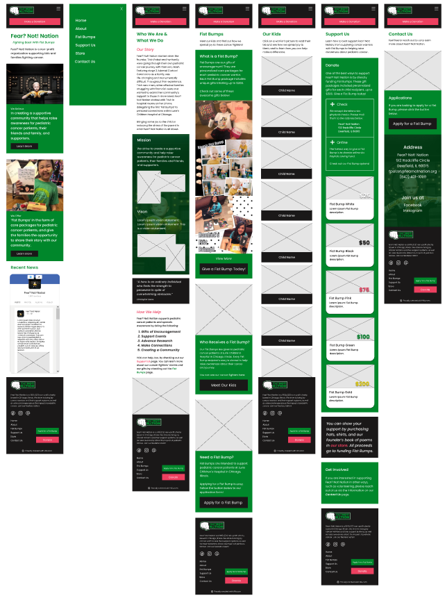
Our final step in the design process was to create an interactive prototype. Our team knew we would be using Wix to build the final product as our client was already subscribed and familiar with the service. We found a suitable template within Wix’s library, then began strategizing and customizing the design based on our findings from our discovery and testing phases. We knew, based on our research from the discovery stage, that we needed to prioritize a mobile-first design. Utilizing Figma and our established design system, we created a mid-fidelity prototype for mobile devices to test our designs and final infrastructure.
Evaluation
In order to evaluate our designs, we conducted usability tests on five unique participants. Over the course of the project, we had identified several key tasks that helped inform our objectives for these usability tests:
- Will users know how to find information about the charity?
- Will users be able to quickly understand what 'fist bumps' are?
- Will users be able to promptly find and apply for a 'Fist Bump'?
- Will users be able to easily donate to the charity?
Our usability tests were conducted in-person and remotely over Zoom Meetings and were recorded with participant consent. The tests consisted of a series of warm-up questions, followed by scenario-based tasks, and post-task questions.
We found that our participants had direct success on 90% of the tasks, and 10% indirect success. In our post-task questionnaire, all users rated task difficulty as ‘easy’ or ‘very easy.’ Our most salient findings from the usability test were that the call-to-action for applying for fist bumps was buried on the page. Our users recommended moving this section and its respective buttons to the top of the page. Secondly, some users were unfamiliar with the term ‘Fist Bumps’ and needed a more direct explanation.
Following our findings and user recommendations, we chose to make the following design changes in our final iteration:
- Prioritize the 'Apply for Fist Bump' section and move the section higher on the page for easier access.
- Make instances of 'Fist Bump' actionable by including hyperlinks that direct users to the Fist Bump page to learn more.
Implementation
In the last week of our project, we implemented our design changes and developed the final website in Wix’s editor. We launched the website at the end of our project timeline, and it is currently live at fearnotnation.org.
Retrospective
Initial contextual inquiry interviews with members of the Fear? Not! Nation community would have given us a richer insight into how their current users utilize the old site’s features.
Registering the foundation for a free Canva subscription sooner would have given us more time to familiarize our client with creating on-brand designs.
Greater team familiarity with Wix as a web development service would have allowed us to better understand how to make a fully-responsive site within Wix’s services. While the site is now mobile-friendly, which was our major goal, the desktop version is not responsive at all breakpoints.